Interaction
We follow a stringent model for determining a chart's data perspective and presentation:
The data filter determines the subset of data that is used in a chart.
Focus, on the other hand, defines the highlighted and labeled elements — stemming either from author settings publishing-time or from user interaction.
Selections
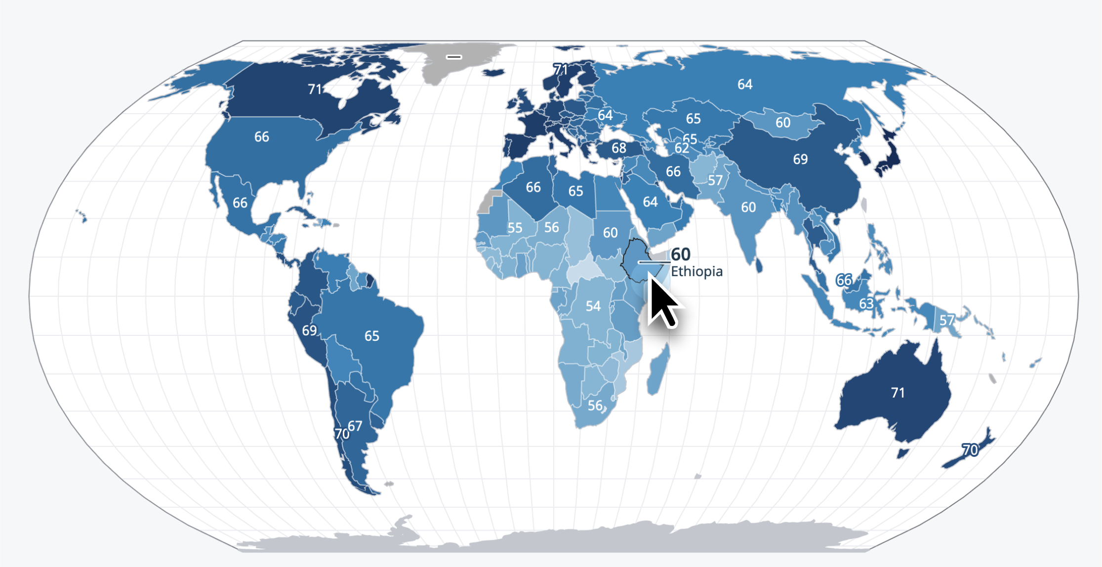
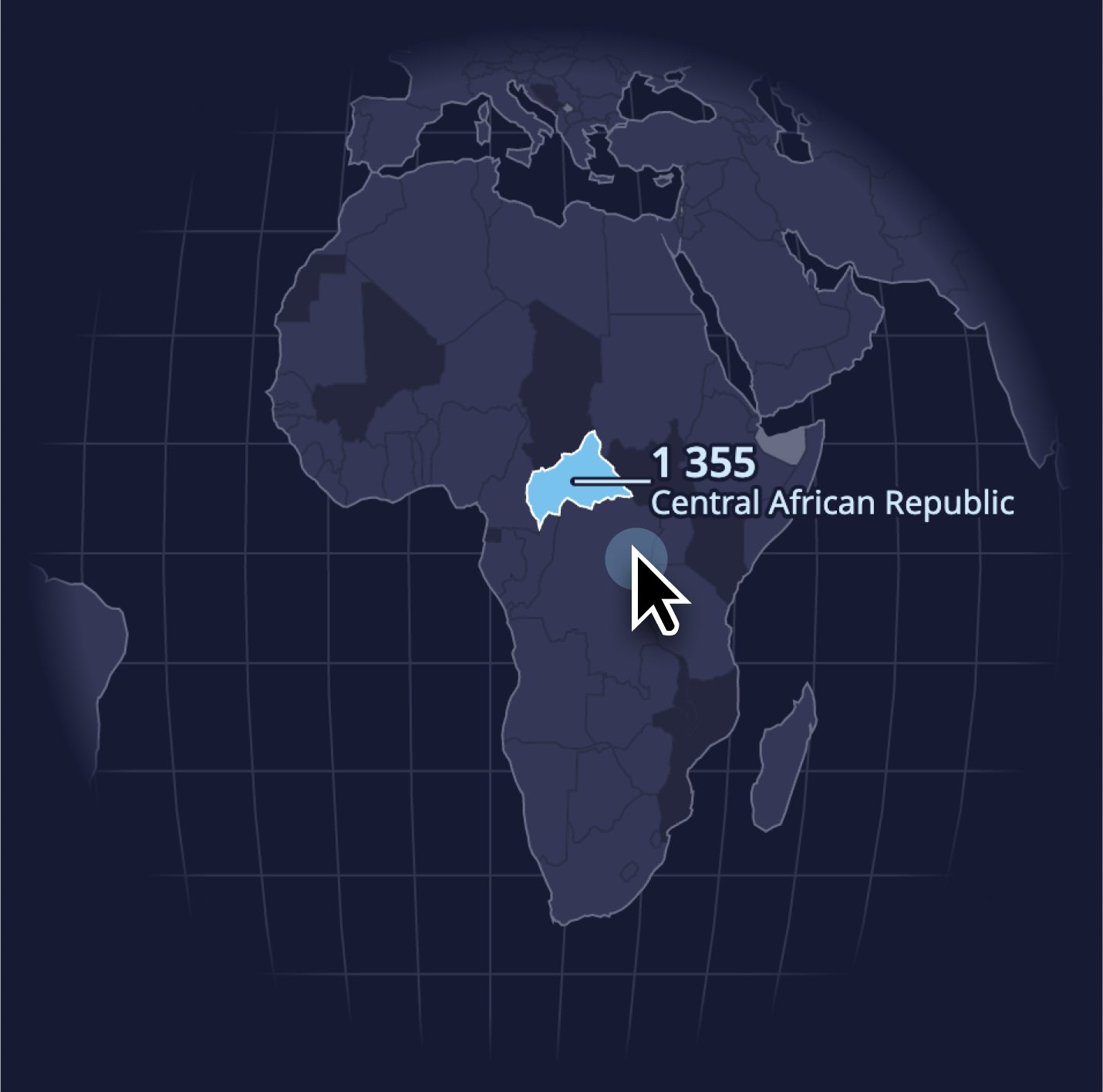
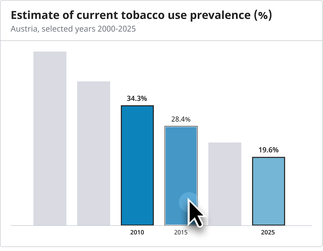
Charts can have selected entities. Selection state can be supplied by the author of a visualization, or the user. Selected items are supplied with data labels, and have a consistent, clearly distinct look. In case the number of selected items exceeds a certain threshold (typically 2-3), non-selected items will be rendered in a uniform, low contrast color, in order to facilitate focussing on the selected items.
Default orientation labels vs. explicit highlights
Explicit, inline value annotation is supplied in all charts and is tied to the selection state of entities. If no specific focus is set, a rule-based set of items (e.g. top X) is labeled in “default annotation” style. In case an explicit (author- or user-driven) selection is set, we switch to “selection annotation” style.