Our charts follow a compositional logic: functional elements and visual layers can be reused and
cmobined across chart types. This enables powerful functionality with a consistent user
experience.
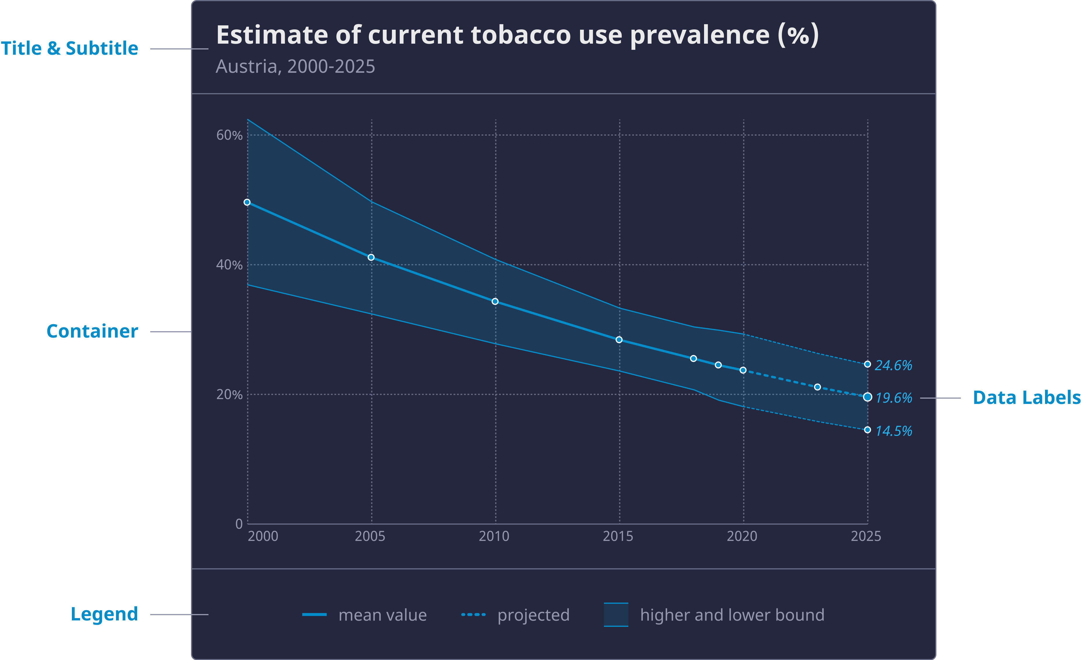
Chart container
Chart container
Chart containers wrap a single chart and offer slots for external elements (e.g. text elements, controls, legends etc). Like charts, containers come in three size sets, depending on their width. Depending on context, different styling options and themes are available. In chart compositions, multiple chart containers are combined, for instance in grid arrangements.
Title and subtitle, source
The chart container supplies information on indicator displayed, the selected geographical units and time range (usually in the subtitle), the indicator unit, and in external contexts, the source for citation purposes. If needed, a caption for further explanatory text can be added as well.
Controls
Charts or surrounding pages can supply a mechanism to select one or more geo-entities (region, country, …), time points or disaggregation categories. Beyond in-chart selection, we also supply standard UI controls such as e.g. dropdowns for reasons of discoverability and accessibility.
Chart elements
Axes
Axes components are used for orientation in cartesian coordinate systems. We supply 3-6 ticks per axis maximum. If there are more available values than ticks, round numbers should be used. Default gridlines are dotted, the zero baseline has a heavy, solid line style. In right-to-left languages, the x-axis is flipped.
Legends
Charts with visual encodings such as color, shape, texture, etc. require a legend to explain the value mapping. We differentiate sequential, categorical, and diverging scales for color encoding, as well as line or mark rendering properties (solid, dotted, …) for value status types (estimated, reported, …). Legends follow the reading direction: in right-to-left languages, the higher end should be placed to the left.
Selection markers
Charts can have selected entities. Selection state can be supplied by the author of a visualization, or the user. Selected items are supplied with data labels, and have a consistent, clearly distinct look. In case the number of selected items exceeds a certain threshold (typically 2-3), non-selected items will be rendered in a uniform, low contrast color, in order to facilitate focussing on the selected items.
Data labels
Explicit, inline value annotation is supplied in all charts. Our charts support auto-annotations (rule-driven hints about data extension, extremes, and data point of interest), inspection labels (as a result of mouseover, tap, or keyboard focus actions for quick data inspection) as well as locked-in, permanent labels (resulting from explicit user- or author-driven selection actions).
Reference marks
Authors can choose to add reference marks (points, lines, areas) to charts. Those are tied to specific data values and can contain a label as well as graphic symbols. Some chart types also offer the option to add data series as reference, such as the global average over time.
Accessibility support
Hidden data table
For accessibility reasons, a table containing all underlying data for a chart is provided in the source code of the containing page. It can be made accessible through a button accessible to screen readers.
Data point elements for accessibility
Hidden data point elements are be added to the graphics element to provide the same information to screen readers. For example, an aria-label with the indicator value and country labels could be added to each circle on a column chart.