Making the data easy to read and understand is one of our prime objectives. In our data representations, we aim to show data as clearly and transparently as possible. This affects visual representations as well as text.
Visual hierarchy with focus on information layer
Visualization components have a clear visual hierarchy that emphasizes key insights to facilitate pre-attentive information processing. The focus lies on the information layer without unnecessary embellishments.
Understandable language & explanations
Language used in titles and annotations is easy to understand and avoids jargon and technical terms. When difficult concepts or unconventional interactions are indispensable, they are explained in the interface.
Consistency across charts
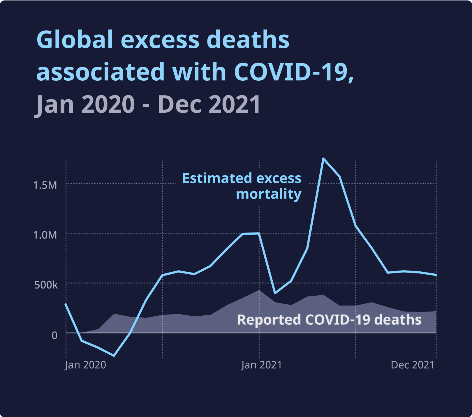
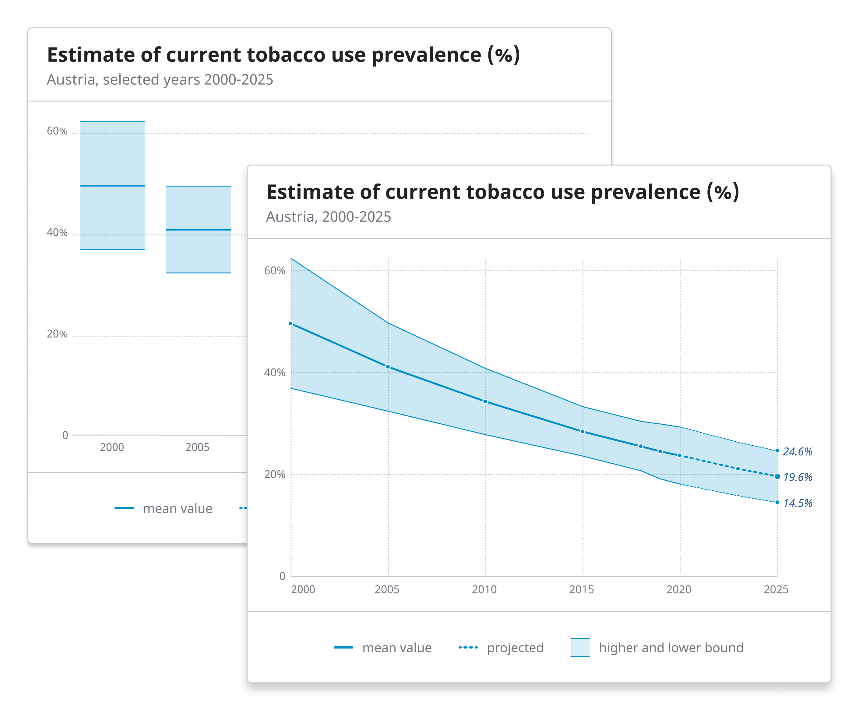
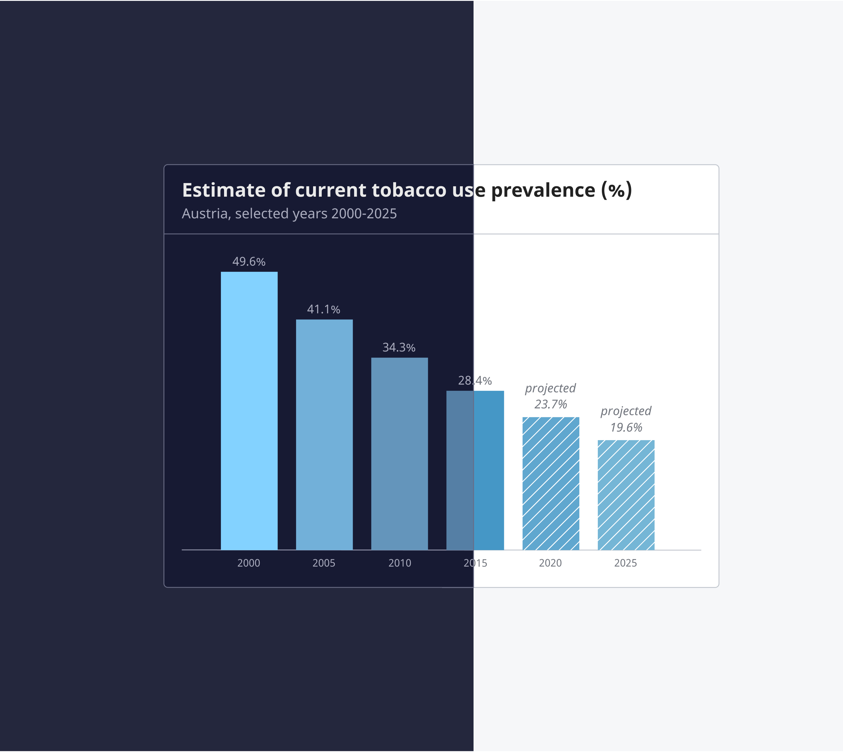
Design tokens and visualization elements are kept consistent throughout the system. A clear visual language for recurring concepts such as special value types, statistical uncertainty, and functional properties foster learnability and understanding of the visual representations.
Optimized for legibility
The design vocabulary aims for high contrast to foster readability in all contexts, screen resolutions and lighting conditions.
Avoid visual clutter
When picking or recommending a chart, the system favors representations that avoid visual clutter.
Intuitive interaction
Visualizations use familiar and widely used interaction concepts. Interactive elements become recognizable through their styling and semantics, and are outlined when focused.