Key methods for improving accessibility include appropriately picked design tokens and chart elements, accessibility-conscious chart design and alternative access modes.
Following best practices & standards
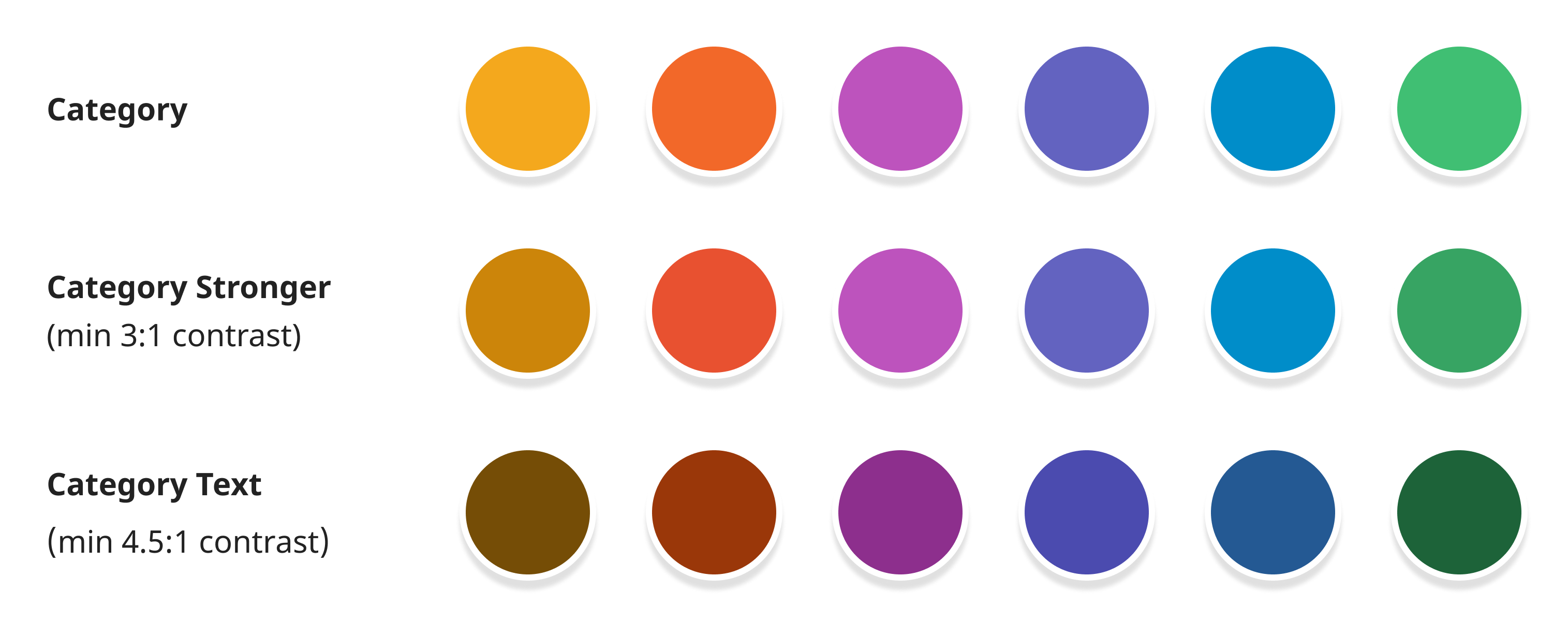
Throughout the design system, components are built on accessible foundations by following best practices and standards, such as WCAG (Web Content Accessibility Guidelines) and are guided by the Access and Equity Framework (created for the World Health Data Hub)
Alternative presentation & interaction modes
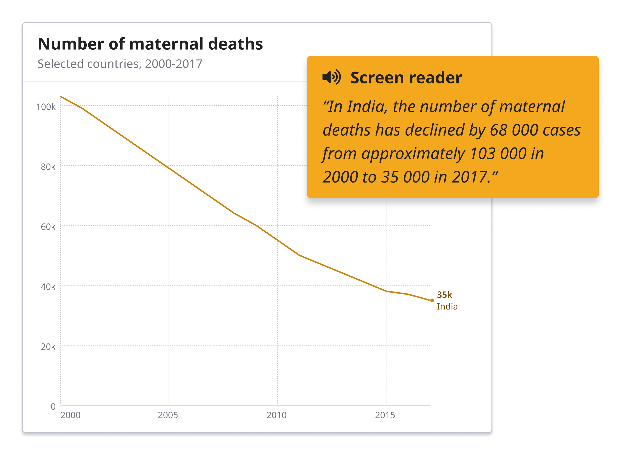
Screen reader alternatives for all charts are equal to the visual representation. They use the same grouping and level of detail, and highlight trends and other visually apparent features where relevant. All interactions are accessible by keyboard navigation.
Explaining and introducing the data
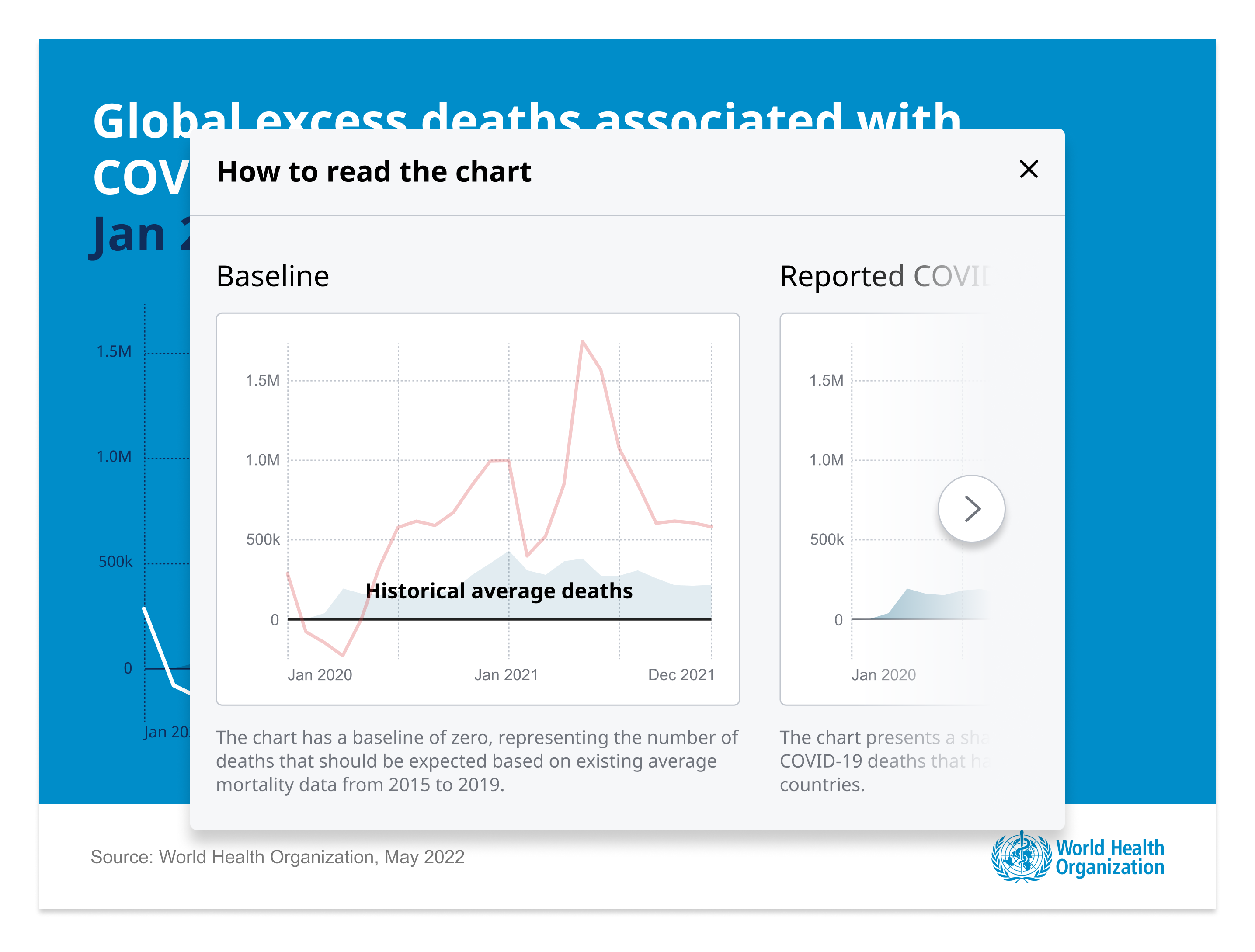
Visualizations use titles, descriptions, legends, and contextual highlights to make them easily understandable. When visualizing complex datasets, multiple visualizations are used in combination, and data is summarized where needed.
Intuitive interaction
Visualizations use familiar and widely used interaction concepts. Interactive elements become recognizable through their styling and semantics, and are outlined when focused.
Information is not hidden behind interaction
Where possible, visualizations do not rely on interaction to reveal important information, and instead use direct labelling.